Making energy bills more rewarding – for everyone

Let’s face it, nobody likes paying energy bills. So, we came up with a way that helped Göteborg Energi customers lower their energy use, save money, and the environment. In short, we made paying energy bills a little more rewarding – for everyone.
Background

Stendahls has been working with Göteborg Energi since 2016 – working continuously to analyse, optimize and improve customer experience and conversion on their website www.goteborgenergi.se

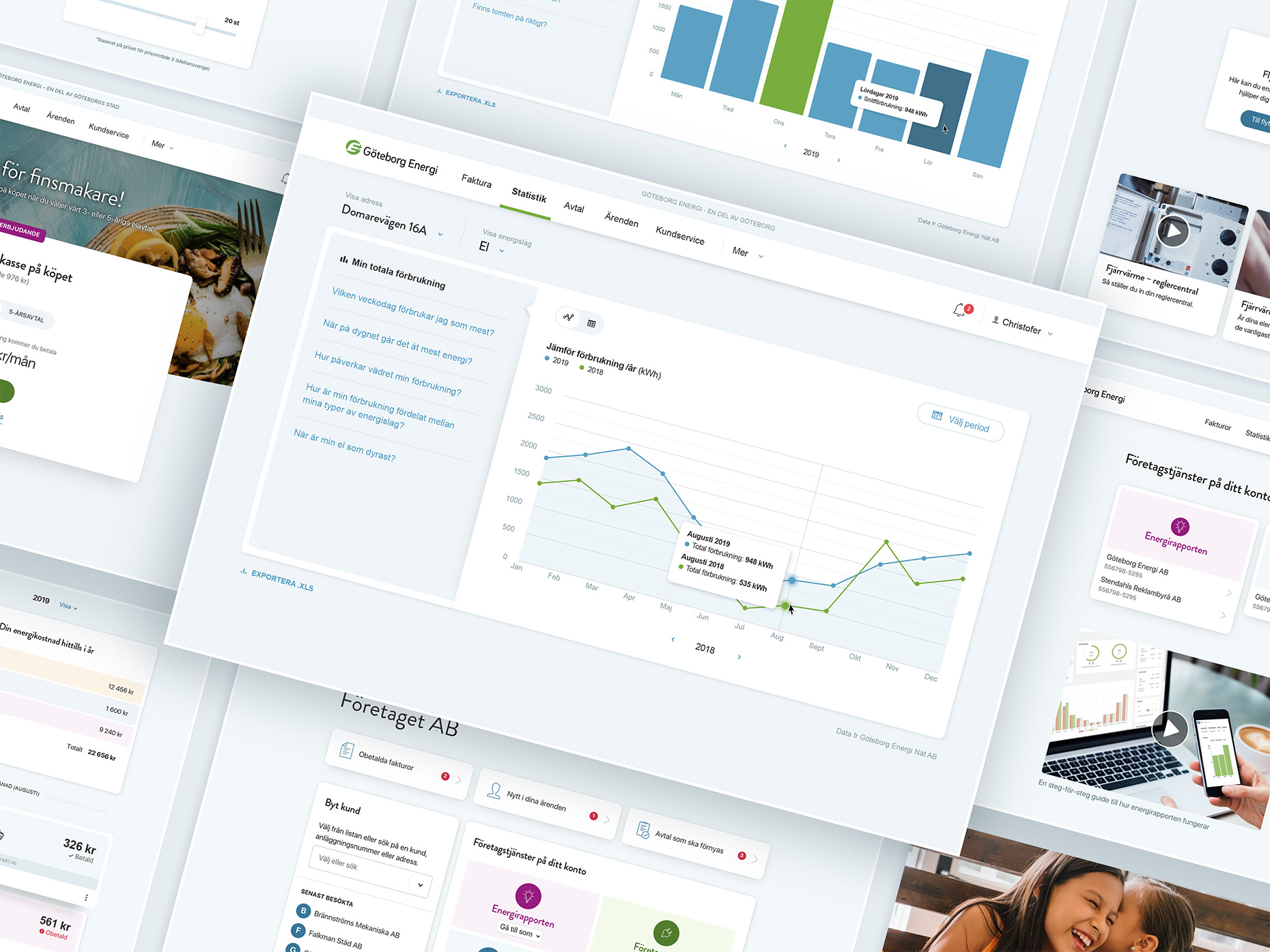
In 2018, it was time for us to use what we had learned to re-work an important consumer section of the site called Mina sidor (My pages). The goal was to create a portal that helped Göteborg Energi customers quickly and easily find content that was relevant to them.


Solution

To gain crystal-clear insight into what was required – from both a consumer and a business perspective – we held extensive workshops and interviews with the relevant target groups and created effect maps.

We then built a core team around the necessary skills and experience. Our team consisted of interaction designers and developers, a digital art director, and a UX-writer. We also worked closely with our data analyst throughout the entire process to help us gain more important insights.


Results

In the end, all our preparation and hard work paid off.
  • During the period March-Aug 2019/2020, the number of customer accounts registered on Mina sidor increased by 24%.
  • The number of electricity contracts signed on Mina sidor increased by 57%.
  • The number of questions asked in the customer chat decreased by 49%.
  • And questions regarding problems signing up to electricity contracts on Mina sidor reduced by a staggering 88%.

“With Stendahls as a digital strategic partner, we have achieved increased customer satisfaction, simplicity, and greatly improved conversation. Stendahls has an ability to challenge, stimulate, live the brand, and deliver on time in a pleasant climate of cooperation.”

Andreas Welinder, Göteborg Energi


Scope

  • Interviews with customers and stakeholders
  • Workshops
  • Data analysis
  • Customer journey mapping
  • Service blueprints
  • UX design
  • Front-end and back-end development
  • Dashboard and metrics
  • Continuous optimization

A chat with Sebastian Sintorn, UX Director


What has been your role in this project?

In this project, my role was highly versatile and multifaceted. It encompassed everything from research and extensive stakeholder dialog to tweaking the user interface for a date picker.

The characteristics of the role also made me something of a coordinator. By heading the preliminary phase and formulating the overall strategy, I become a natural part of most of the discussions and decisions being made throughout the project. The coordination aspect of the role gave me a complete overview of the project, and I was able to support the other roles in our effort to deliver an optimal experience.


How would you describe the challenges and opportunities working in this project?

How to create value – for our client as well as for the end consumer – was the primary goal going into this project. Value for an energy consumer often translates into the ability to comprehend one’s consumption pattern and how to influence it in a positive way, regardless of whether the incentive is economic or environmental.

Early in the project we were able to identify a gap between the needs of the user and the tools provided using impact mapping.

The industry standard today basically boils down to the exposure of raw data – your accumulated measuring points represented as graphs and tables. This is an essential but very basic level of information. Our research clearly showed that this basic level of information wasn’t enough. It left the user confused and frustrated, creating fatigue that stopped them returning to the site. The solution was to add additional layers that helped people easily understand their data, and answer questions regarding their energy consumption.

Related cases